Work
A 30,000ft visual history.
-
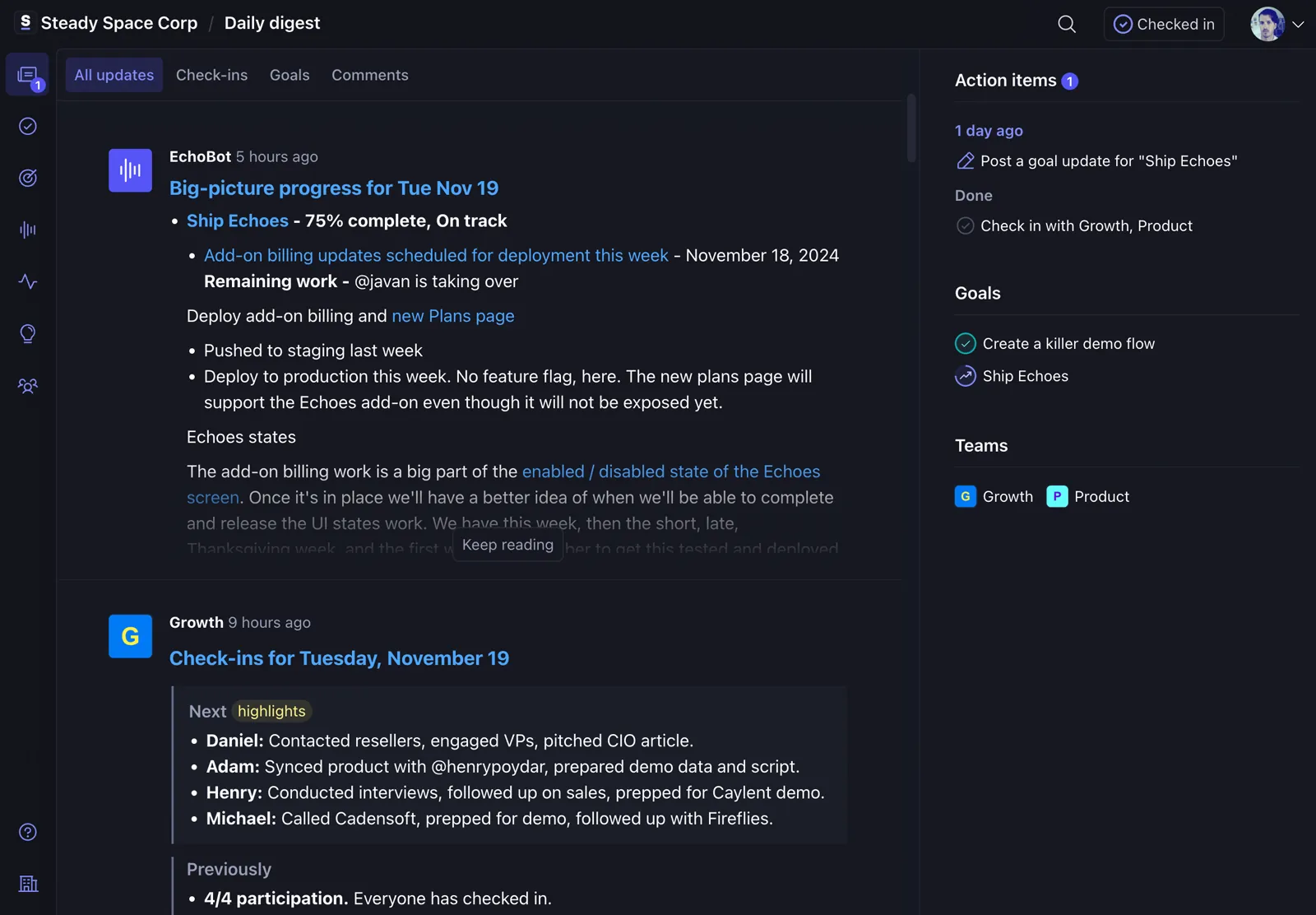
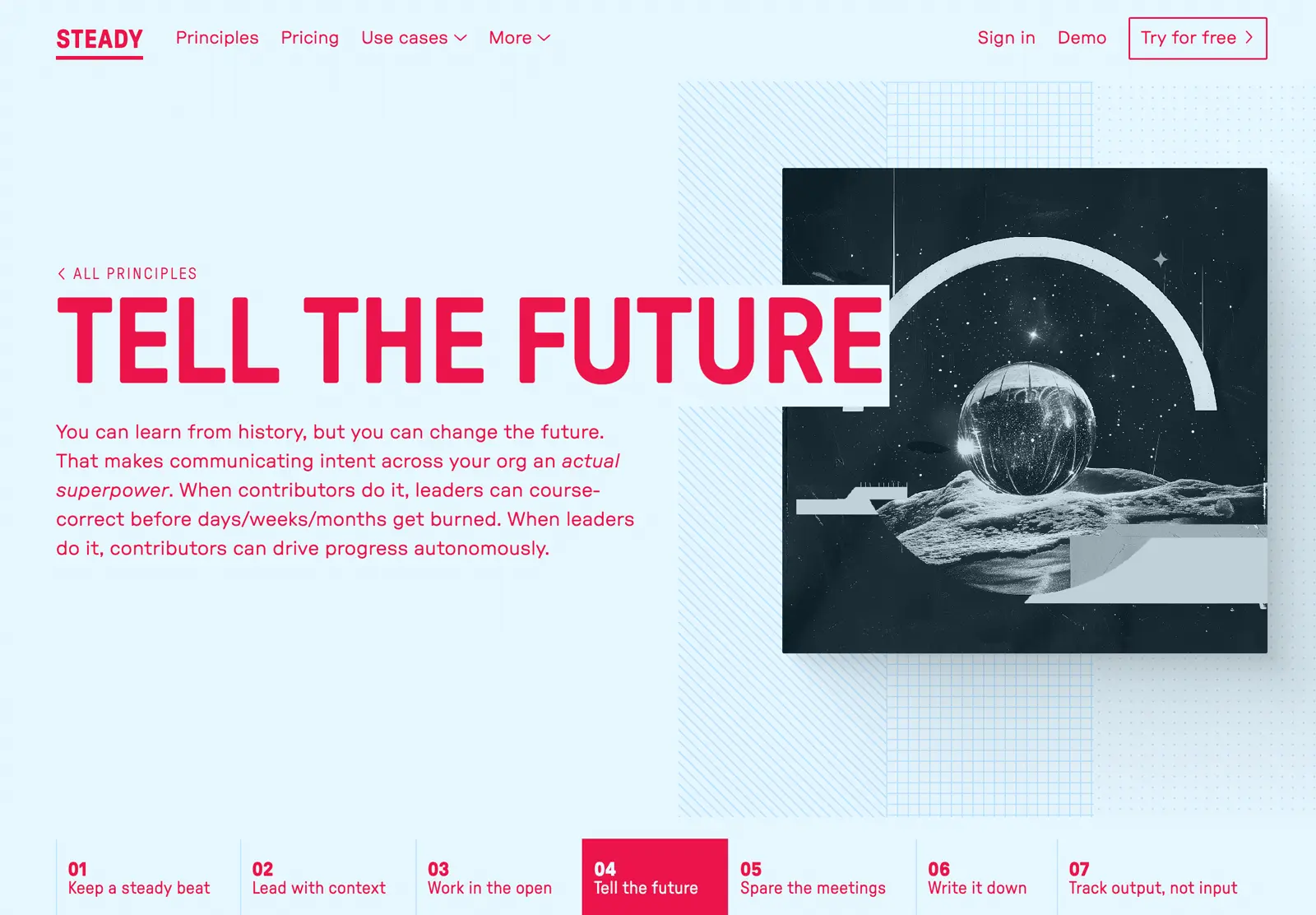
Steady
I was hired at then Status Hero to help transform a tactical check-in tool into a comprehensive solution for solving complex team coordination challenges. A complete overhaul of… everything later, Steady was born.
role: product strategy, product design, branding, front-end development-

-
-
-
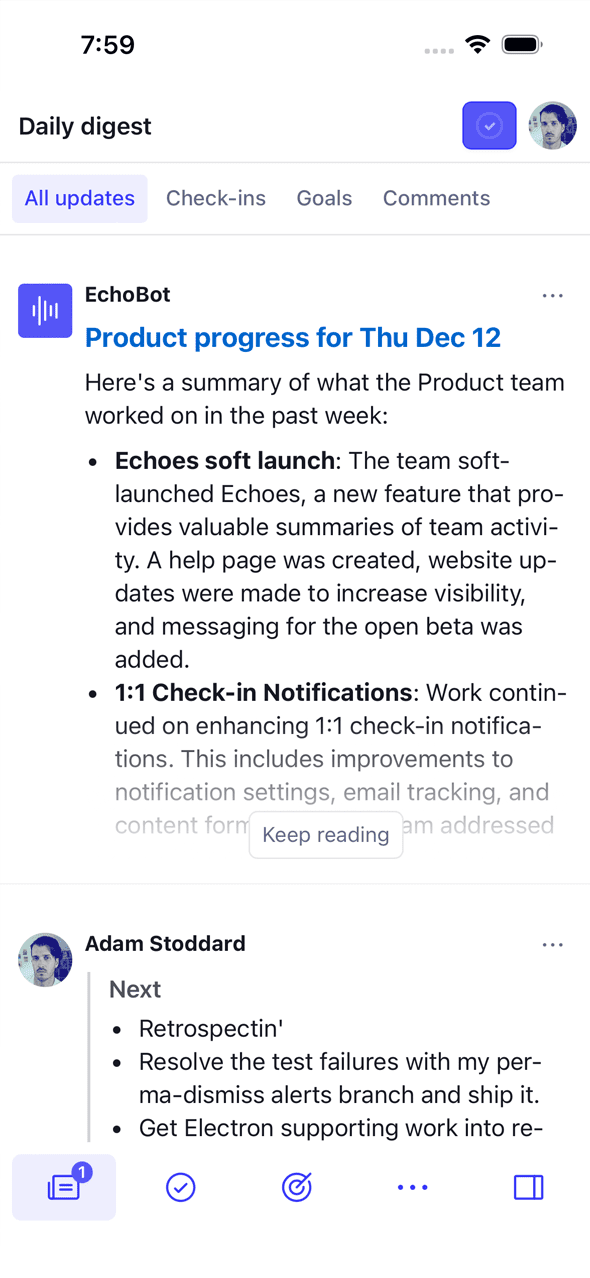
I spend most of my time working on product, which is to say, I spend a lot of time thinking about how to help teams work together better. A byproduct of that is Continuous Coordination, an approach I co-developed with Henry Poydar.
-
-
-

-
-
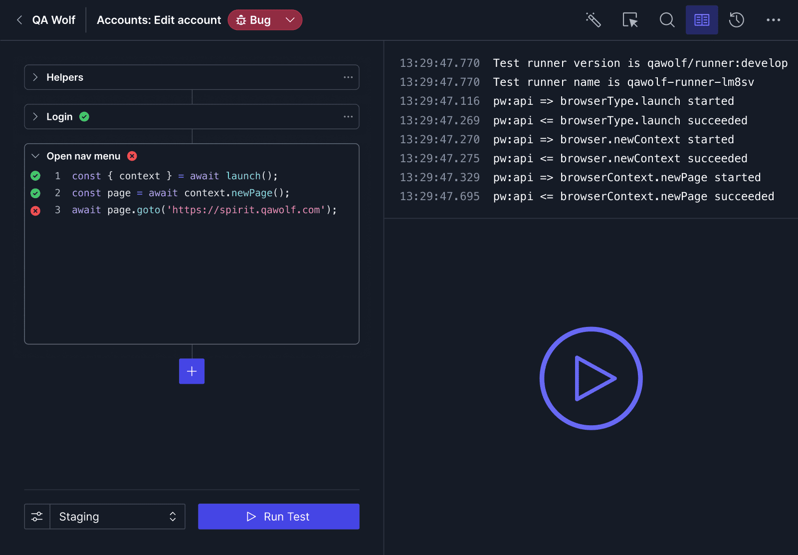
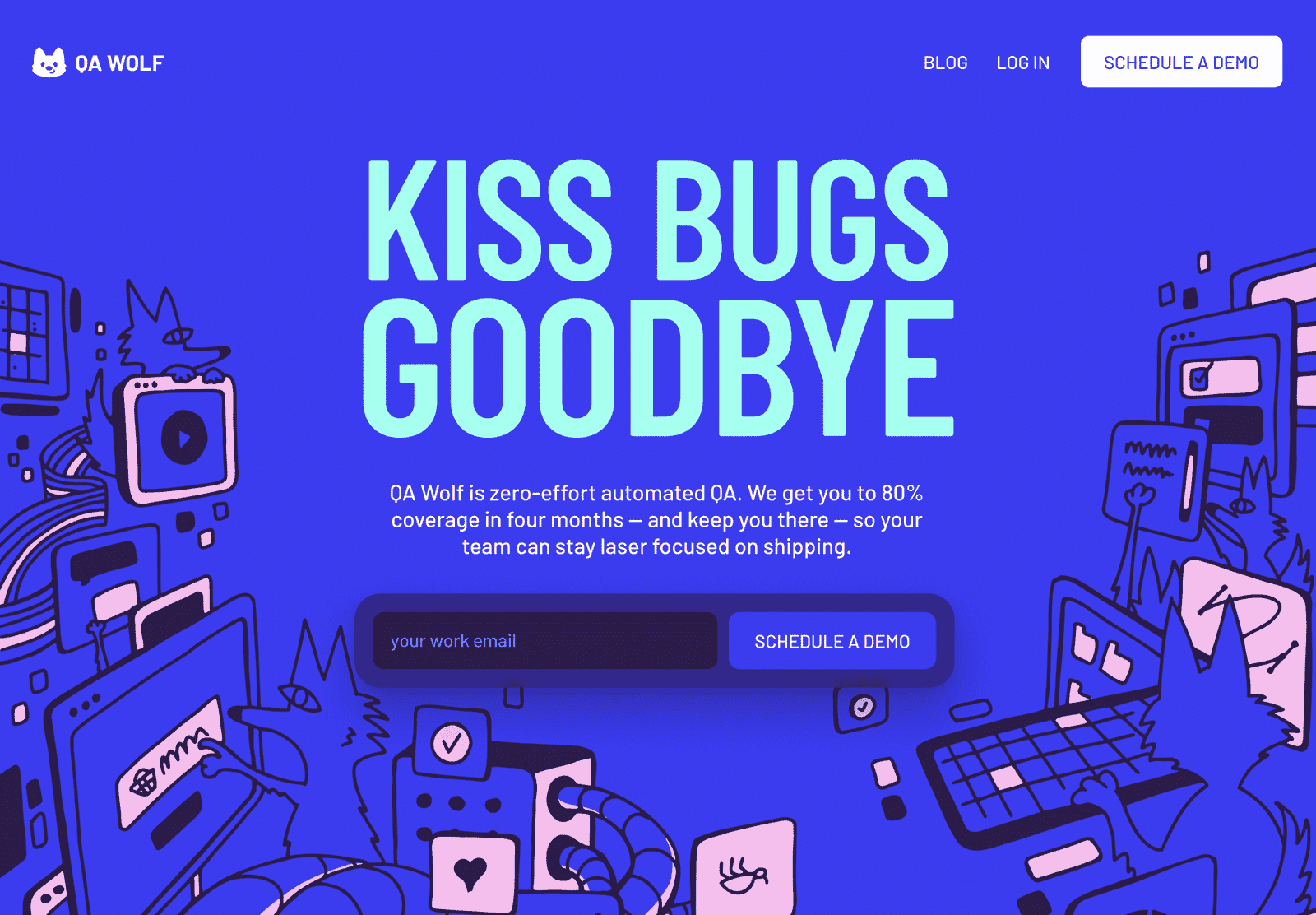
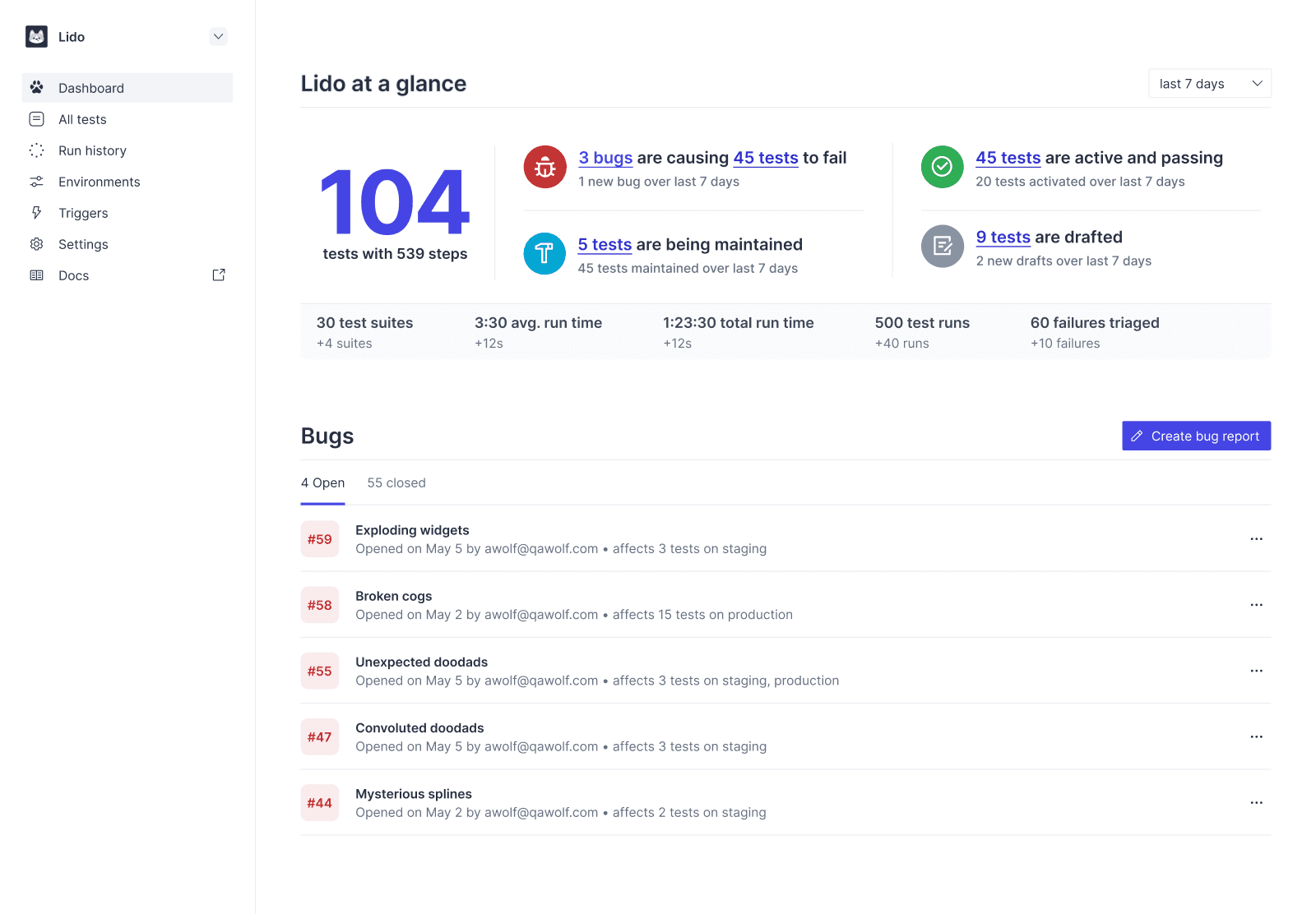
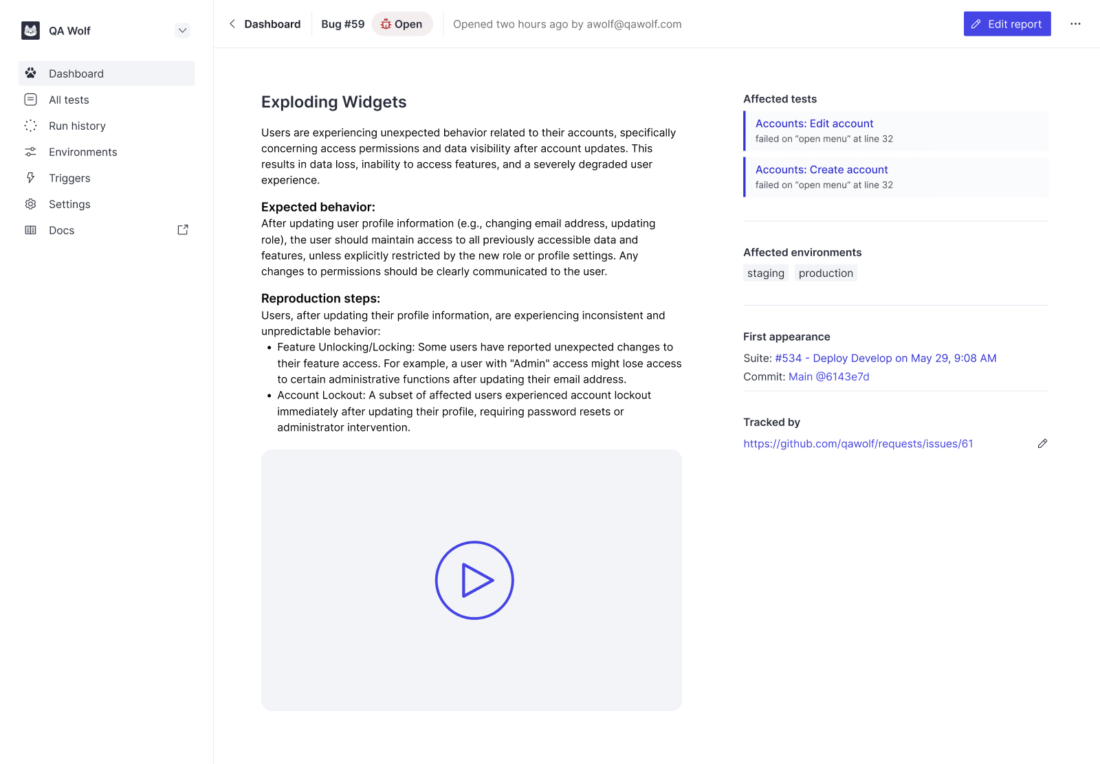
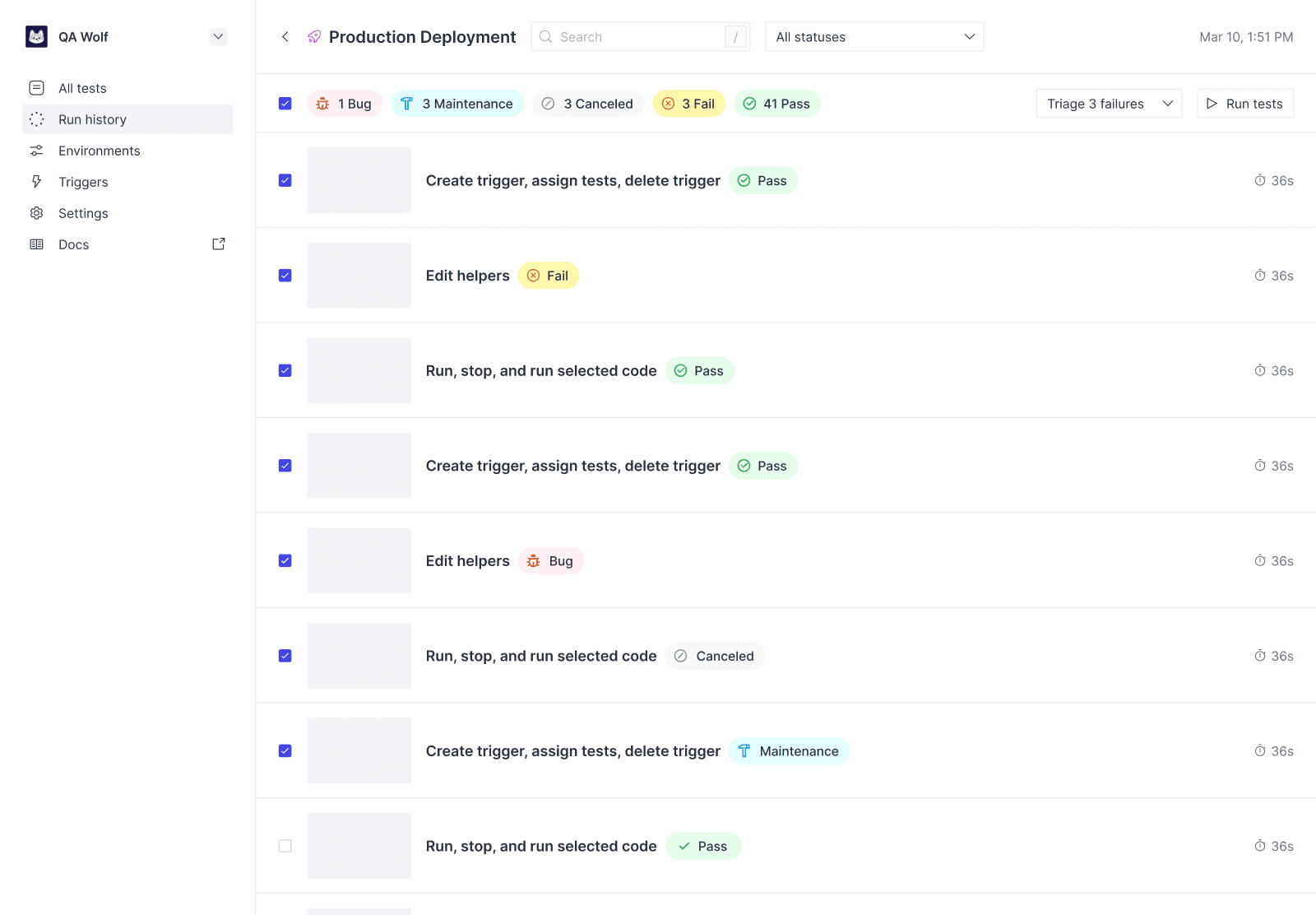
QA Wolf
QA Wolf is a novel approach to software testing that’s part people, part platform. The challenge; flesh out the product in order to seamlessly blend the two, and solve some longstanding pain points for customer and QA engineers alike.
role: product strategy, product design, branding -
-
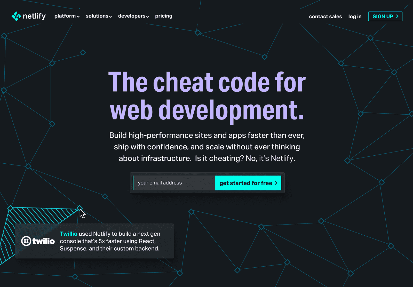
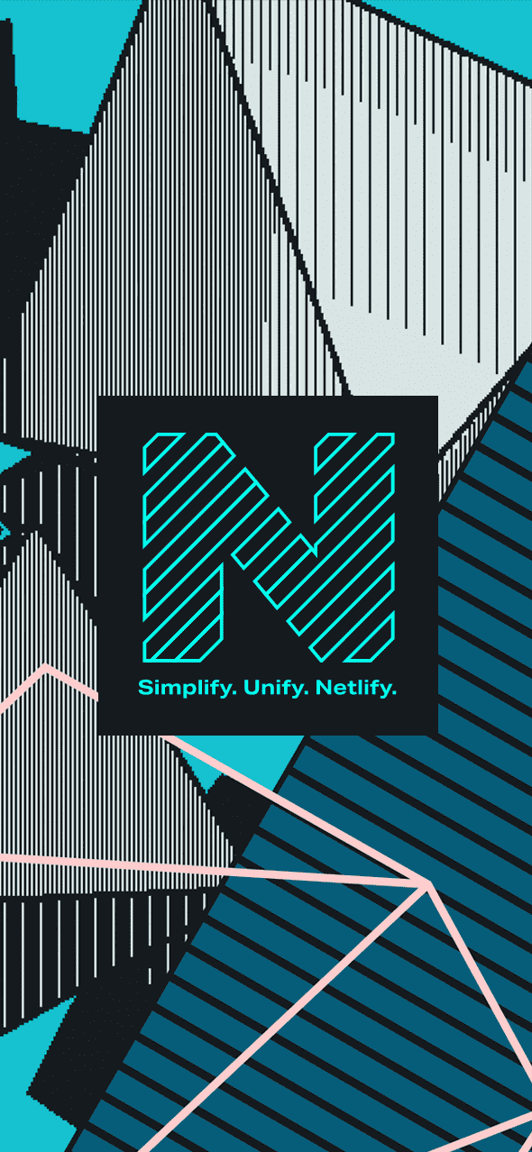
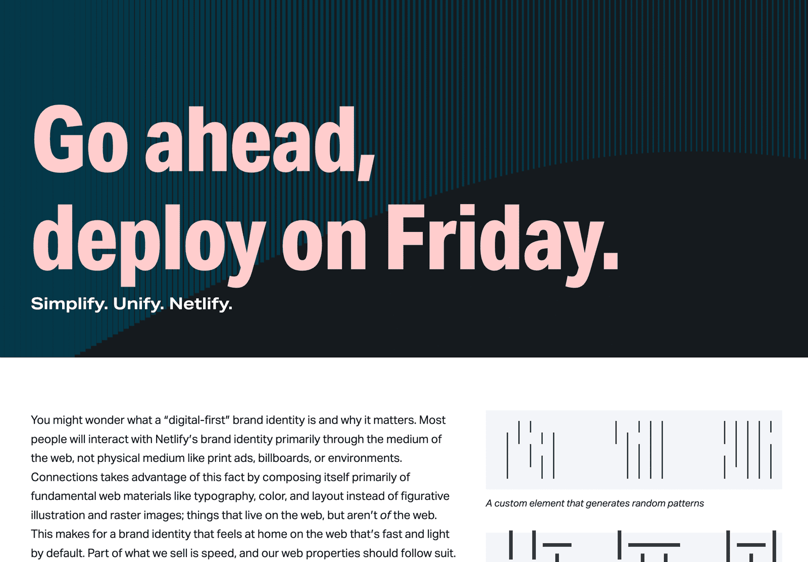
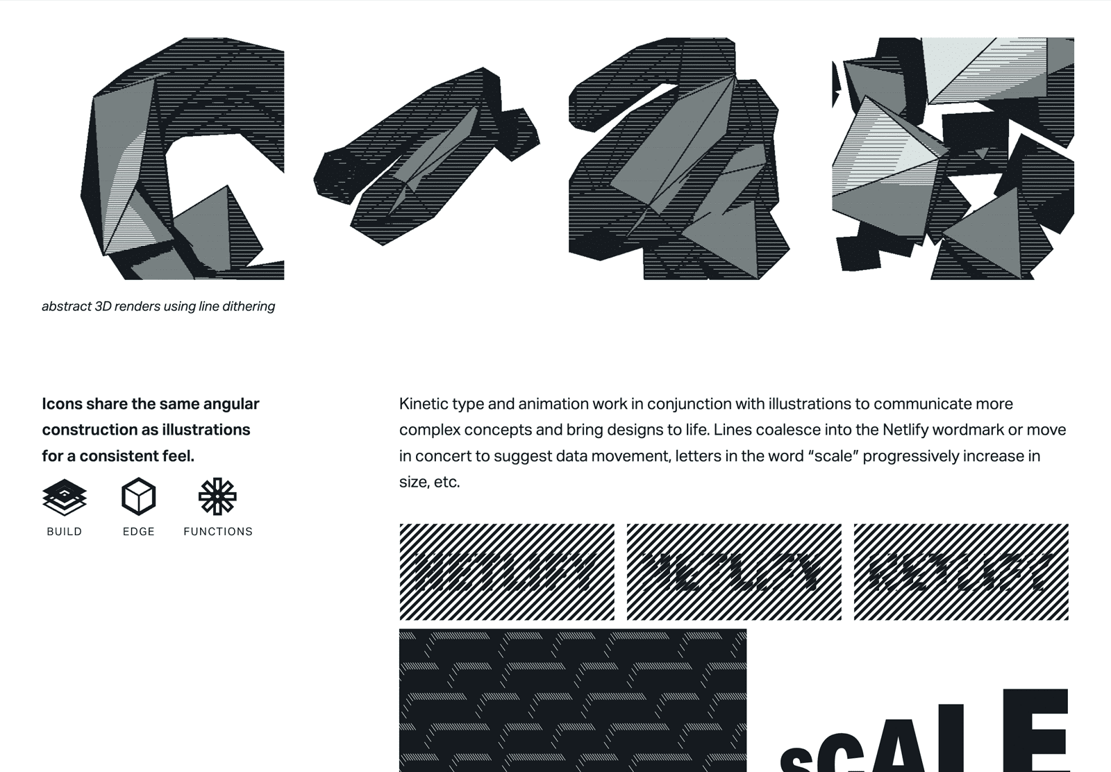
Netlify
My time at Netlify was split between day-to-day marketing design, and going deep on design explorations for a comprehensive rebrand. These are highlights from my favorite direction, which was technical-but-fun, web-forward, and distinctive.
role: brand strategy, marketing design, copywriting -
-
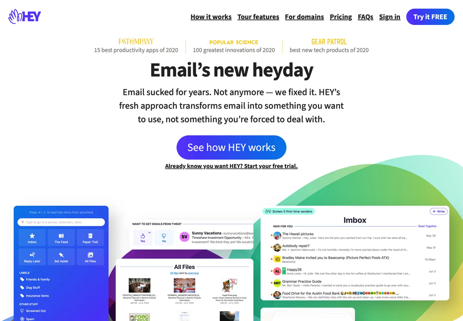
Hey
Technically still a Basecamp / 37s project, Hey was a re-imagining of what an email app could/should be. My job; design a brand identity for email that felt as refreshing as the product itself, and bring it to life on the web and in the app.
role: brand strategy, marketing design, front-end development, copywriting-

-

-
-
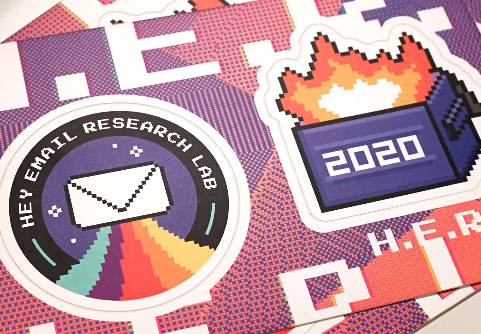
A major marketing push for Hey was the ‘Hey Email Research Lab’ AKA H.E.R.L., which was a venue for oddball email-centric experiments. I designed the identity, the website, and the merch.
-

-
-
-
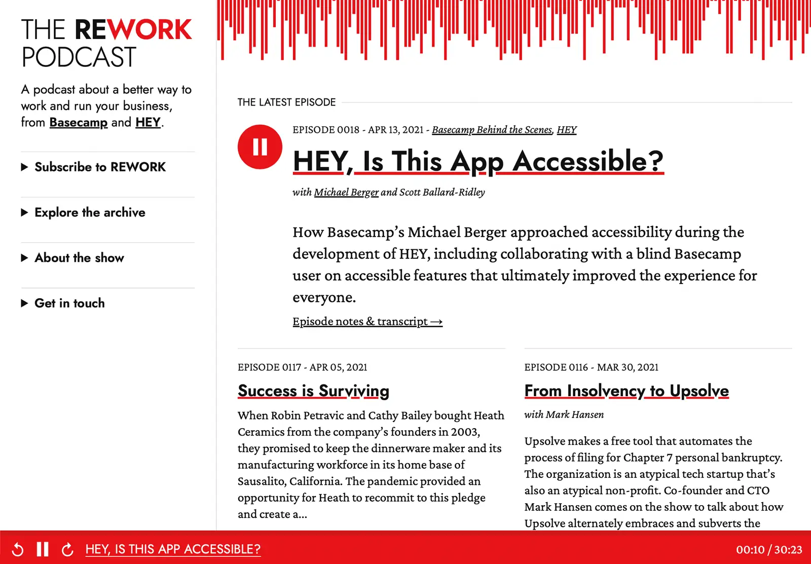
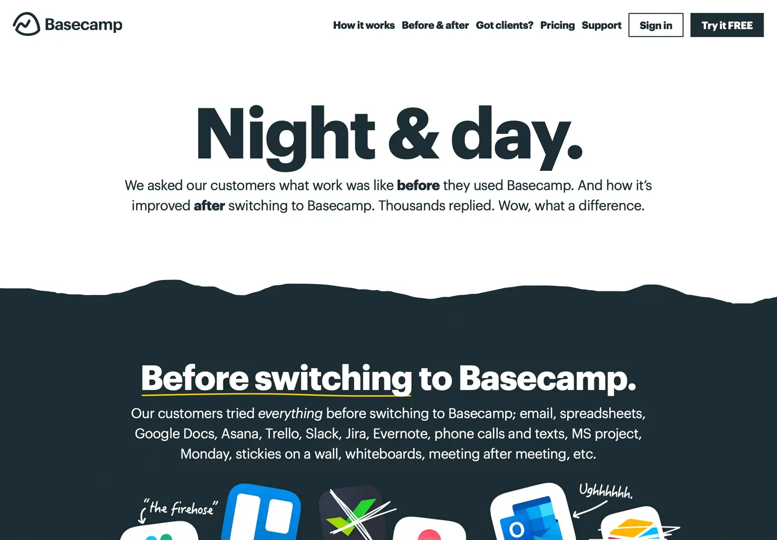
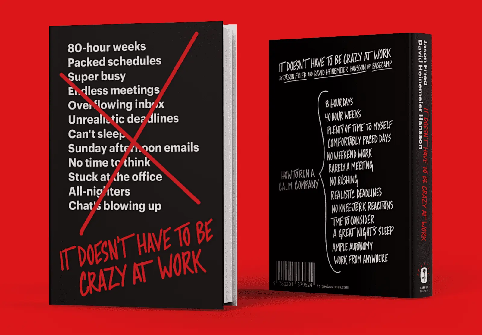
Basecamp
My role at Basecamp is best described as an internal agency of one. This was a wide ranging role, covering a major rebrand, owning basecamp.com top to bottom, running conversion experiments, designing merch, building a multi-format self-publishing system, and designing & building a range of websites; storefronts, blogs, docs sites, etc.
role: brand strategy, marketing design, front-end development, copywriting-
-
-
The Basecamp brand and website were just the tip of the iceberg. I worked on branding, design, and dev for allll of the sub-brands and open source projects too.
-
-
-
-
-
-
-
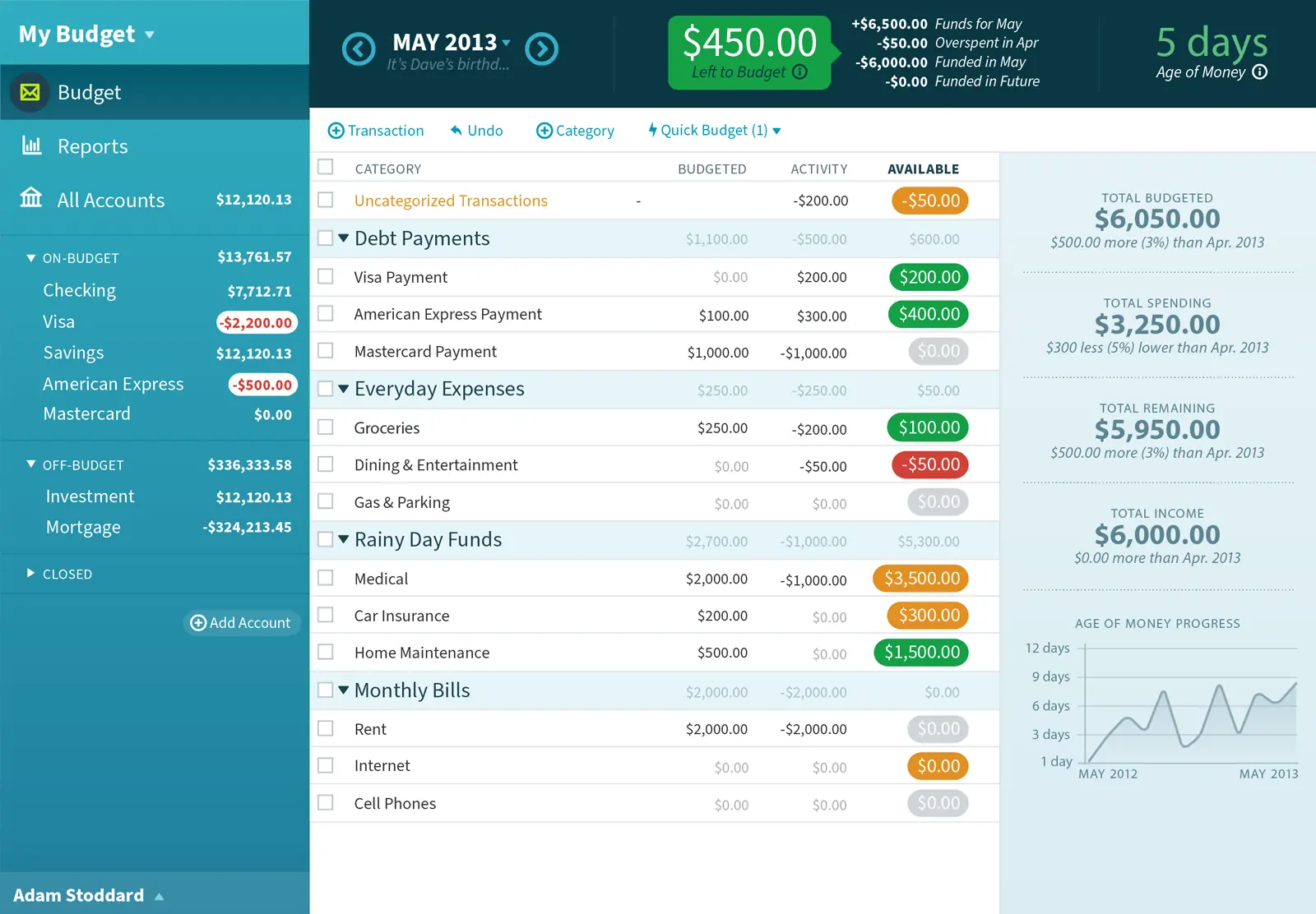
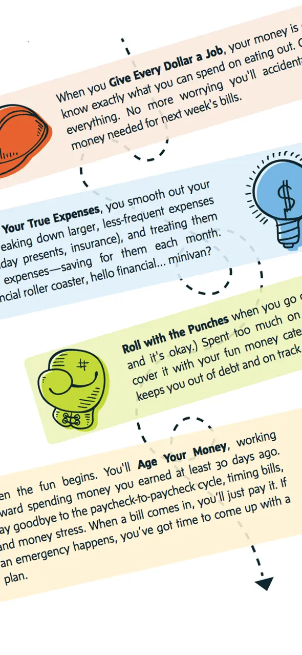
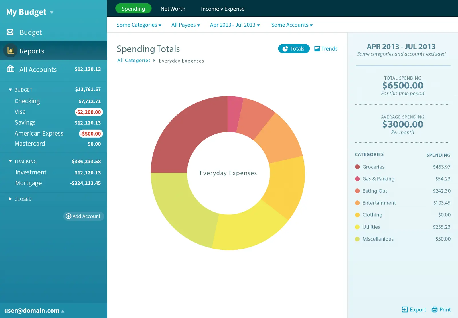
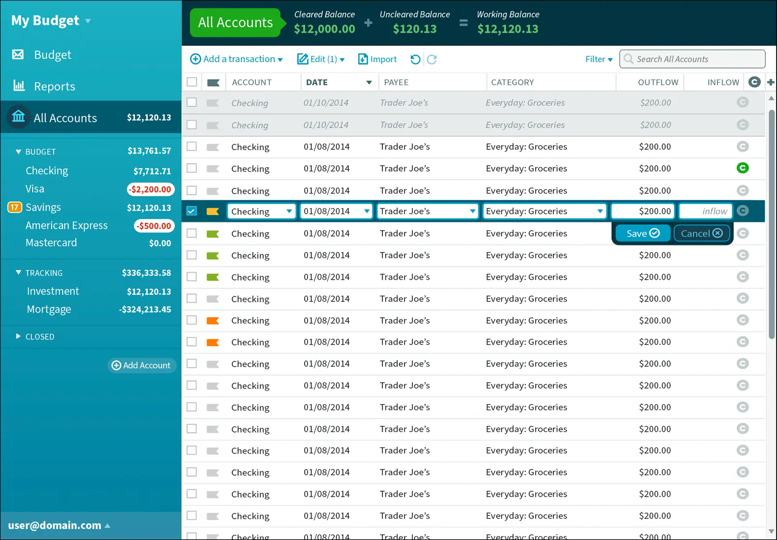
You Need A Budget
I joined YNAB as the founding designer when it was still an offline, 100% manual Adobe Flex app. I led the charge to re-imagine YNAB as a web app, and introduced key features that helped YNAB grow from niche product to the budgeting app.
role: product strategy, product design, branding, front-end development -
-
The agency years
Before I started working in tech, I honed my chops at agencies and running my own studio. Mostly building brands, websites, and apps. Documenting all the work from this time period sounds exhausting so… imagine a bunch of cool work here.
-
this one is very compelling
-
so design forward
-
award-winner right here
-
truly avant-garde
-
you’re impressed at this point
-